I have just listened to the BBC Radio 4 programme Soul Music and this time it was discussing Handel's Messiah. They mentioned a flash mob rendition of the Halleluja Chorus so I went to YouTube and found this one ... I wish I'd been there!!
http://www.youtube.com/watch?v=SXh7JR9oKVE
As I looked for this video, I found this one from Antwerp ... music and dance ... do re mi from the Sound of Music ... http://www.youtube.com/watch?v=bQLCZOG202k&feature=related
And from T5 Heathrow ... http://www.youtube.com/watch?v=bMbYPVxfRmw&feature=related ... our lot can ruin any good idea.
A much better one from Singapore's Changi airport ... http://www.youtube.com/watch?v=Q6-fHQZU9vk&feature=relmfu
And this one from Birmingham ... http://www.youtube.com/watch?v=WM2Agu_DktM&feature=related ... Michael Jackson Thriller
Best, formal, choreography has to go to this one http://www.youtube.com/watch?feature=fvwp&NR=1&v=9OawiTae0bA ... another Michael Jackson based one.
There are other flash mob videos on YouTube that you have probably seen and I think they are all fabulous too.
DW
3.3.12
British Politicians
I have seen politicians come and go in the UK but it strikes me that the current batch are the biggest crowd of sub standards we have ever had. Having made that assertion, I will tell you now that I have done a bit of digging into the careers to date of some of our most senior politicos.
PM Cameron ... no real experience and did PPE at Oxford
Deputy PM Nick Clegg ... no experience and did Social Anthropology at Cambridge
Chancellor Osborne ... no experience and did History at Oxford
Foreign Secretary Hague ... limited experience and did PPE at Oxford
Education Secretary Gove ... journalist and did English at Oxford
Ed Miliband ... no real experience and did PPE at Oxford
David Miliband ... no real experience and did PPE at Oxford
Ed Balls ... no experience and did PPE(?) at Oxford
Get the drift? We are all at sea aren't we?
DW
Birdwatch!
Earlier this Winter I felt sorry for any birds around my house and having found myself with some waste lard to get rid of, I made up a fat candle: lard, seeds and breadcrumbs, moulded it and put it outside for the birds to eat.
Day 1 ... no birds
Day 2 ... no birds
Week 1 ... no birds
Week 2 ... no birds
For several weeks there were no birds in sight. Eventually the fat candle went and I started putting out my waste bread and that went quickly.
So, I am getting the birds used to my free food and now I want to set up a hide in my kitchen so that I can take photos of them.
I'll keep you fully informed!
DW
2.3.12
Recipe from my Khmer Cookery Course
I did promise to share some of the recipes from the cookery course I did in Siem Reap and here is a dessert for you.
 Nom Tong Noun

Ingredients
Rice flour 1/2 Cup
Duck egg x 2
Sugar 1 tablespoon
Coconut cream 1/2 cup
Black sesame seeds 1 teaspoon
Oil 1/4 cup
Method
1 Set aside one duck egg and the oil
2 Take the rest of the ingredients and combine to make a batter
3 Beat the remaining duck egg and mix with the oil
4 Heat your NTN or waffle pan until its hot
5 On one side brush some of the oil mix - until the side is
covered
6 Place your batter on the other side
7 Cook for a few minutes then roll into a cone shape while they
are still hot.
These are a delicious snack and perfect to serve with coffee or
tea
DW
26.2.12
How to look gud!
Isn't it odd that at the time when we need to be perfect we are often at our most stupid or lax?
Here is an example from one of my own web pages:
"This page begins by reminding us that there is always someone more stupid than we are. However, non of us is perfect so the file then goes on to show us the best way to do things."
Otherwise that is a good page on spreadsheet good practice!
See http://www.duncanwil.co.uk/spread_prac.html
DW
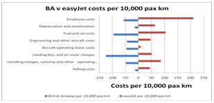
How to Construct a Population Pyramid Style of Chart Using Excel 2007
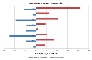
The population pyramid is a very effective way of presenting data in situations in addition to reporting populations. The following example shows how true this is when I compare some basic data for British Airways and easyJet:

This is a very effective form of presentation, don’t you think? It is! After all, there are times when you may well want to compare this year with last, one company with another, male with female … and a table of data or even a line or ordinary bar chart just aren’t effective enough.
How did I prepare that chart, then, using Excel? What follows is all you have to do!
Firstly, derive, find or grab your data. As you are working along with this example, just copy and paste the following into a blank Excel work sheet:

To begin with, make all easyJet values NEGATIVE. Just put a minus sign in front of them all. It will become obvious why we do this shortly.
Then select these data and press the F11 key and Excel will then draw a graph for you … automatically. Excel will draw your default style chart when you press the F11 key and the chances are that it won’t look anything like the population pyramid you want but don’t worry! Since we are here to sort that our. Click on the Chart and on the Chart Tools Menu, Design sub menu. You can then change the chart type if necessary ... see the screenshot below to see all of this:

Choose Clustered Bar Chart, as you can see in the dialogue box that follows:
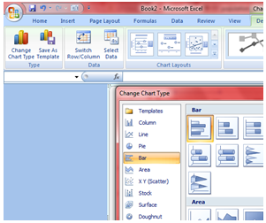
Click OK and you should see something like the following:
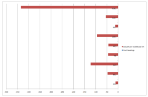
If necessary, right click on the chart and select Source Data and click on the Series tab.
Remove the first series per 10,000 pax km
For British Airways, click on the Category Axis Label icon and select the appropriate range, Excel will show it like this ='Sheet1'!$X$X:$X$XX ... it says Sheet1 or whatever it says on the worksheet tab where the data are kept
Now select the second series that also says per 10,000 pax km
Select the Name icon and then select the cell where it says easyJet
Format the chart in terms of title and axes labels as you wish:
Click next again and type in the titles you want to put onto your Chart … you can see what I did. If you are using different data, type what it most informative and appropriate. At this stage, my chart looks like this!
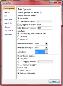
As it stands, the negative values are mixed up with the vertical axis labels. To sort this out, right click the vertical axis and make the following settings:
The legend is very useful for this graph but it is better to put it at the bottom of the chart: right click the legend, Format legend, Placement, Bottom. You should edit the legend so that it reads BA and easyJet rather than the lengthy versions you might be able to read in the chart above. If you chart has a coloured background, it’s best to get rid of it ... and grid lines: right click, clear each of them will do that for you
Change the colours of the bars if you want: right click format … you choose!
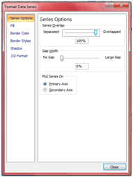
Very, very nearly there now. All that’s wrong is that the bars are offset from each other. You could leave them like that but it’s not so attractive is it? So let’s adjust the bars:
Right-click on any one of the bars and select Format Data Series
Click Options tab and make the following changes:
Overlap = Change this to 100 in the appropriate text box.
Gap width = Change this to 0 or 10 or 20 ... in the appropriate text box ... try them all and see which you prefer
OK
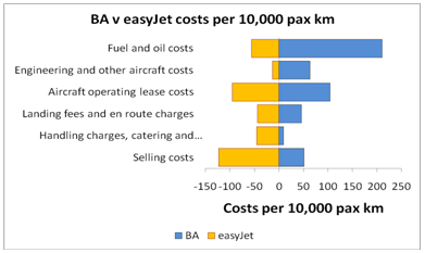
That’s it: you’ve now got a population pyramid of your dreams! Change the colours of the bars as you wish. Change the font and the font size and colour too.
For the final version I have removed the two data points Selling Costs and Handling Charges ... This is my final version: orange bars for easyJet because that’s its house colour … I changed the font size, I put a border on my chart … and so on.
I have taken you through this process step by step. This process is a little complicated but once you have done it twice or three times, you will breeze through it!
Duncan Williamson
Subscribe to:
Comments (Atom)