Introduction
I have used fan charts before, a long time ago. This week one of our Excel famous, Mark Proctor from Excel off the Grid, posted a video showing how to create a fan chart. I watched the video and decided to try to create a fan chart. using Python in Excel. And I did it!
A Fan Chart
This is a fan chart, as created by the Bank of England: it seems that the Bank of England first invented the fan chart:
My Fan Chart
My Colourful Fan Chart
- the legend no longer masks part of the fan
- the elements of the fan are in colour now: this is not vital, just more appealing
The Python Code
The code that will create the fan chart refers to lines 1 - 13 and the code on lines 37 - 38 print out the chart on your Excel worksheet.
All the rest of the code is concerned with formatting.
The Data
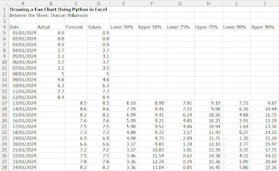
The data I used are shown below and you could easily add to or remove the data to make your data frame larger or small, as you wish.

- E17 =C17 - (ROW(C17)-ROW($C$17)+1)*0.675*STDEV.P($C$17:$C$28)
- F17 =C17 + (ROW(C17)-ROW($C$17)+1)*0.675*STDEV.P($C$17:$C$28)
Reminder, the value of 0.675 refers to the number of standard deviations for the 50% cut off, it is 1.15 for 75% and 1.96 for 95%.
Enhancing the data
I trust you find the above to be a useful addition to your Python and charting armoury. However, I felt that the chart looked a bit spartan so I enhanced the data and therefore the fan chart by creating these scenarios:
Lower and Upper Boundaries
- 50%
- 60%
- 70%
- 80%
- 90%
I also added a bit of code to soften the fans a little bit as I felt their edges were a bit hard. Here is the full code for all of that: again, copy and paste the code into your Excel file or just download my file by clicking on the link at the end of this post.
import pandas as pd
import matplotlib.pyplot as plt
try:
# Load Excel data
df = xl("A4:N28", headers=True)
# Merge Actual and Forecast into a single series
df['Values'] = df['Actual'].combine_first(df['Forecast'])
df['Date'] = pd.to_datetime(df['Date'])
# Create the fan chart
plt.figure(figsize=(10, 6))
# Use a vibrant color scheme
plt.fill_between(df['Date'], df['Lower 90%'], df['Upper 90%'], color='#FF9999', alpha=0.6, label="90% CI")
plt.fill_between(df['Date'], df['Lower 80%'], df['Upper 80%'], color='#FFCC99', alpha=0.4, label="80% CI")
plt.fill_between(df['Date'], df['Lower 70%'], df['Upper 70%'], color='#FFD699', alpha=0.3, label="70% CI")
plt.fill_between(df['Date'], df['Lower 60%'], df['Upper 60%'], color='#FFFF99', alpha=0.4, label="60% CI")
plt.fill_between(df['Date'], df['Lower 50%'], df['Upper 50%'], color='#FFFFCC', alpha=0.6, label="50% CI")
# Plot Actual and Forecast values
plt.plot(df['Date'], df['Values'], color='#0066CC', linewidth=2, label="Actual/Forecast") # Blue line
# Customize the chart
plt.title("Fan Chart with alpha Controlled Colours")
plt.xlabel("Date")
plt.ylabel("Forecast Value")
# Move the legend to the top left corner
plt.legend(loc="upper left")
plt.grid(True, linestyle='--', alpha=0.6)
plt.xticks(rotation=45)
# Show the chart
plt.show()
except NameError:
print("Data not defined. Please load the data first.")
Conclusion
There you are, enough to get you started with a basic fan chart that looks a lot like the fan charts that the Bank of England might produce. Download my file to see some of the developments that I built into the fan chart as I created the example and as I sought to improve what I had done.
Download my Excel file
Duncan Williamson
11 December 2024


No comments:
Post a Comment