Introduction
Let’s begin with an easy to follow demonstration then we can work on an example of a table of data that relates to the holiday rota of people in an organisation. The list contains the start and end dates of any holidays that these members of staff have taken, are taking, or are going to take in the current year; and we will be using a Gantt chart to transform the names and dates into useful information.
Having seen how to create and use Gantt charts, the final part of this page takes us through a multiple activity Gantt chart. The chart used looks a bit complex but we should appreciate that it contains many data points; and once it's in chart form, it becomes really simple to read and use. This part of the page also includes detailed instructions on how to use the Excel Function NETWORKDAYS(): a very useful function that can save both time and the capacity for errors! The NETWORKDAYS() function is a versatile function that can be used in a variety of situations.
Creating Gantt Charts
Take a look at Table 1: imagine that we want to visualise how the project to which that table relates is progressing: the order in which they are progressing, the length of time each activity takes and so on. Difficult, isn't it? A table of data in such cases is of limited value, so how can we present such data so that it can answer the questions we need?
One way is to buy or use Project Management Software: such software will take a table such as Table 1 and prepare automatically a GANTT chart for us. Alternatively, our solution is to program an Excel Spreadsheet to prepare a Gantt Chart for us. More than that, we are going to prepare the chart in such a way that we obtain maximum benefit from it given that the average printer will print out onto a piece of A4 paper.
Creating a simple Gantt chart isn't difficult when using Excel, but it does require some setup work. Gantt charts are used to represent the time required to perform each task in a project. Table 1, shows data that was used to create a Gantt chart.
It is best if you read this part of the paper and have Excel open and running on your computer at the same time. You can then practice exactly what we are describing here to make sure everything works and you understand it.
Table 1 Data used in the Gantt chart

Here are the steps to create this chart in Excel: Figure 1 is the chart you should end up with.
Figure 1 A Gantt Chart Created from a Stacked Bar Chart

1 Enter the data as shown in Table 1. The formula in cell D5 (end date), which was copied to the rows below it, is =B5+C5-1.
2 Insert Stacked Bar Chart from the range A5:C15: this is the second subtype, labelled Stacked Bar, see Figure 2, below.
Figure 2 Initial Gantt Chart

3 Notice that Excel incorrectly uses the first two columns as the Category axis labels, hence the messy appearance of Figure 2. I have already removed the Legend at this stage.
4 Right click on your stacked bar chart and click on Select Data then click Add to add a new data series, setting the new series to the following:
5 Now for the Gantt Chart Magic. You can see that both series are shown on the chart, one blue and one dark red … of course, these colours depend on your settings and they might be different colours on your monitor. Click on the larger bars, blue in my case. Right click on one of the blue bars, change Fill to No fill and change borer to No outline …
- New Series : B5:B15 … name it Start Date … make sure this is at the top of the list
- You should see the existing series as: C5:C15 … name it duration
- Change the Category (x) axis labels to A5:A15 for both series
Figure 3 Almost Finished Gantt Chart

6 Using the grab handles, resize the chart so that all the axis labels are visible: you can also do this by using a smaller font size. Give the chart a useful name and do any other formatting you wish.
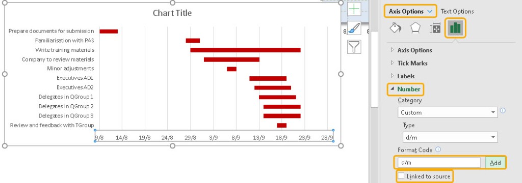
7 Right click on the horizontal axis and adjust the horizontal axis Minimum and Maximum scale values if necessary: to correspond to the earliest and latest dates in your data. Y can enter a date into the Minimum or Maximum edit box and Excel will convert them to a value). You might also want to change the date format for the axis labels, as shown below:
Figure 4 Changing the Format of the Horizontal Axis
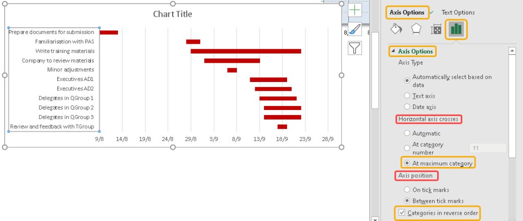
8 Right click on the vertical axis and in the Scale tab, select the option labelled Categories in reverse order, and also set the option labelled Value (y) axis crosses at maximum category.
Figure 5 Set the Ordering of the Vertical Axis
9 Change your chart title, apply other formatting, as desired
Holiday Schedule and Gantt Chart
Let's imagine the table below shows the full list of staff members of an organisation and then imagine that we need to create a holiday planner, Gantt Chart: when will Mr or Mrs X be returning from holiday and so on. Figure 5 is the Gantt Chart of the full holiday schedule
Figure 6 Holiday Data and Gantt Chart

How useful is this Gantt Chart? Sometimes not very! Basically, this chart includes everyone who has declared their holiday plans. We can see that there is a bar for everyone that shows the duration of their holiday and when it takes place.
Using Monthly Holiday Planners
Gantt Charts become very difficult to read very easily and if so, we should break down the information we have and prepare sub graphs from our data. One way of doing this, with the holiday schedule is to create separate graphs for June, July, August, September …
To do that, sort the data into date order: start date. It might also help to colour code the data in the table as a way of helping to identify the data from month to month.
Download my Excel file:
Duncan Williamson
4th October 2020 & 11th January 2021
No comments:
Post a Comment