Introduction
As we talk generally about mathematics and statistics, we often hear the phrase, "X is increasing exponentially". We look at the graph that comes with such a comment and, yes, the curve shows the data are increasing slowly, slowly, more rapidly, much more rapidly ... and we conclude, that's exponential growth. Is it though? And what does exponential growth actually look like?
COVID-19: exponential growth?
Newspapers and the media in general do talk constantly about exponential growth in the context of the COVID-19 pandemic. This article discusses this aspect of the pandemic by demonstrating what exponential looks like and how we can use Goal Seek in Excel to model it.
COVID_19 Charts
Here are a few charts based on Covid-19 for the UK:
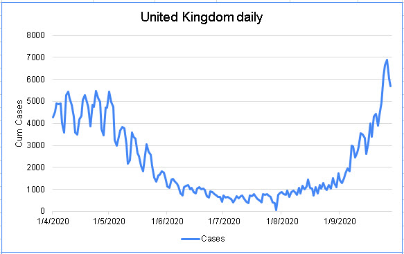
We do not directly see anything exponential there, do we? Well, let's look at August and September 2020, then:
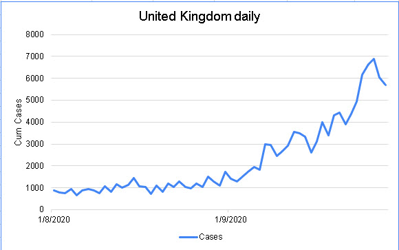
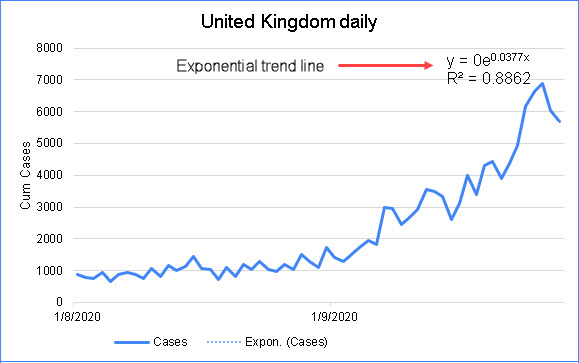
The R2 value is very high, at 0.8862 but, since it is not equal to 1, it is not perfect! How about the cumulative number of Covid-19 cases in the UK, then? Take a look:
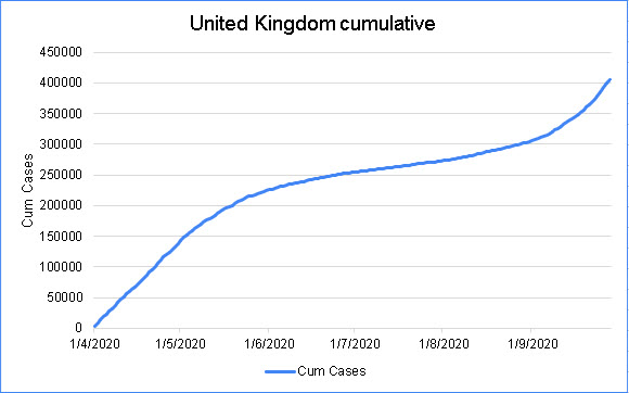
As with the raw data, not conclusive. Try again:
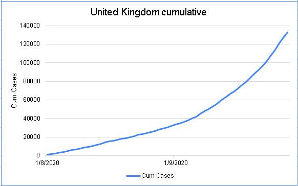
Looks promising in terms of exponentiality but when I tried to add the exponential trend line to that graph, it was greyed out: not possible to evaluate it. Not exponential, then.
Another Approach
Let's take another approach by using an exponential template and fitting our data to that. I found a google sheets file on the web that discusses this topic and took their lead in the following screenshot:

You can download my spreadsheet to follow along in more detail with what follows. You will see I have made a number of changes to the original file and there is a link to the original file in my Excel version.
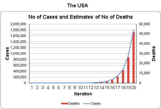
The use the R and CFR metrics as the foundation of this model. R is the reinfection rate: a value of 1 says that, on average, we will infect one other person if we have the disease. The R of 1.98 in the screenshot is for the USA and it tells us that everyone who catches covid-19 will, on average, infect almost two other people.
The CFR metric is the Case Fatality Rate, shown as a percentage and it tells us that if 100 people die when 1,000 people were infected, the CFR is 10%. As you can see from the screenshot, the USA CFR was 2.88% at the end of September 2020.
Formulas in the Table
The formulas in the table are as follows:
B5=A5+B2
B6=B5+(B5-A5)*B$2 ... copy that down to B26 in this case, to 29th January 2021
C5=B5*B$3 ... copy that down to C26 in this case
D15= 11th September 2020
D16=D15+10 ... the table is modelling changes to the case and death data every 10 days from 11th September 2020 to 29th January 2021
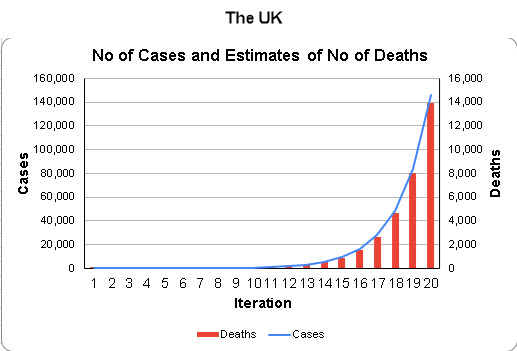
In the range F3:M8, I have added the actual total cumulative case and deaths data for several countries that I have then added to the table by using Goal Seek. Watch the video that accompanies this page to see how I did that.
What we see is that each country has its own R and CFR values. For example, while the UK has a relatively low R value, its CFR is veery nearly 10%, way above the others. Of course, the USA has a massive number of deaths but their CFR is one third of that of the UK.
The Graph
As you change the data in cells B26 and C26, you will see how the model illustrates the data for each country EXPONENTIALLY:
Conclusions
We can see that the term Exponential means something specific and while the covd-19 rates of increase are often high and very high, that does not mean they are increasing exponentially.
Download the Excel file and the video that I have created for this page and check your further understanding of this page
Spreadsheet: covid_exponential
Video file: covid_exponential
Duncan Williamson
3rd October 2020
No comments:
Post a Comment