Introduction
I came across an electric kettle over the weekend that had a thermometer on it. That means, as the water boiled, we can see how the temperature rises and so we can see when the water is about to boil.
You can imagine that a data hog like myself would find such an asset to be a wonderful thing. I set about gathering data from it. Of course, I had to collect the data manually and I didn't do it perfectly. However, this page tells you what I did and how I am sharing this with you.
Analysis
Over on YouTube there are two videos to support what I did with this project but in summary, it is this:
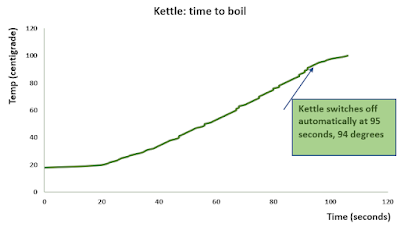
Kettle_1 I filled the kettle with an unmeasured amount of water, including water straight from the fridge and the starting temperature was shown as 18 degrees. I switched on the kettle and recorded the time as the temperature increased by one degree. The kettle switched off at the 94 degree mark but it continued to heat the water to 100 degrees.
Kettle_2 and Kettle_3 I filled the kettle with a measured amount of water, water straight from the tap only and the starting temperature was shown as 33 degrees. I switched on the kettle and recorded the time as the temperature increased by one degree. The kettle switched off at the 94 degree mark as with Kettle_1.
From the data for Kettle_1, the following graph:
Notice the S shaped curve and I explain in the videos why the line might be jagged rather than smooth.
I use the model I obtained from these data to make predictions of the times and here is one of the residual graphs. My model is a Polynomial Order 5 model
y = -4E-08x^5 + 9E-06x^4 - 0.0009x^3 + 0.0502x^2 - 0.6124x + 18.511 with an R^2 of 0.9993
We normally expect a random distribution of residual points, don't we but since we know this is not a linear series, what you see here is more like what we could expect.
I also created a linear model and you can see that in the videos.
Kettle_2 and Kettle_3
Following the weaknesses in my approach to Kettle_1, I set up these two experiments more carefully and here is what I found. Firstly, the graphs of the raw data with their polynomial order 5 models.
The residuals graph for Kettle_2 is here:
and the equivalent graph for Kettle_3 is very similar to that.
Comparison of All Models
The following table shows the six sets of results I created from this exercise: three polynomial order 5 and three ordinary least squares models
Comparison of Means
I felt that Kettle_2 and Kettle_3 results were likely to be almost identical so I checked statistically to see if that might be the case. I carried out a comparison of means test of the two data sets and while I cannot say that the two sets of results are identical, they are, statistically, essentially interchangeable.
The following table confirms what I just said.
Summary
I was taken by the idea of a thermometer showing live data from boiling water in a kettle so I did all of the above. I found it interesting to see what comes out of an exercise like this and the statistics are a bit more interesting that some ordinary, every day, small exercise. In the end, I demonstrated that we have to be careful when setting up even an informal exercise like this: realising I had not controlled the amount of water in the kettle! Knowing that I had put water from the fridge in the Kettle_1 experiment but that I did not want to do that again!
I didn't go so far as to worry about ambient temperatures, the wattage of the kettle element and so on but what I have done is useful, I am sure.
Videos and Excel file
The videos are found in my channel in YouTube
Video 1
Video 2
Duncan Williamson
6th February 2023


No comments:
Post a Comment