Introduction
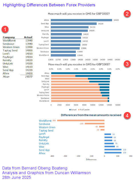
Yesterday, I saw a post on LinkedIn that showed the different amounts receivable from 11 different foreign exchange companies in Ghana Cedis from an Exchange of GBP1,000. In this post, I am showing
- the data provided
- the graph provided
- two alternative forms of presentation
I have put all of this on a single image.
UPDATE: you can watch the video on my YouTube channel in which I discuss this matter.
The Problem
The problem in these situations always is how best to make comparisons between different cases. In the case of the 11 amounts receivable, we don't see the x axis scale on the original graphic but it's easy to see that Bernard, the creator of the chart, broke the axis: it does not start at zero.
The effect of breaking the axis scale is that it misrepresents or over emphasises the values under review. That means it appears as if we would get a massive amount more from Afriex than from Remitty or Sendwave. In truth, Remitty would give us 97.16% of the amount AFriex would give us and Sendwave would give us 96.60% of that. Not such massive differences. Of course, why should Remitty and Sendwave keep the extra 3% or so at our expense? Fair question but that's not the point here.
The point is that the kind of chart that Bernard presented has broken an axis and by not declaring that, he is misrepresenting the story, however innocently.
The Graphics
Conclusions
Don't take this as an admonishment of Bernard: he did what thousands of people are doing every hour of every day. However, we need to understand that data analysis and data visualisation bring with them the duty not to present data in ways that might be misleading.
Duncan Williamson
28th June 2025

No comments:
Post a Comment